REDESIGNING SUBSCRIPTION PLAN ● MINING JOURNAL

Optimizing User Experience: Analysis and Redesign

At- A- Glance

UX Analysis of the Mining Journal subscription plan looking at key user experience improvements and redesigning a simple example of the improved version.
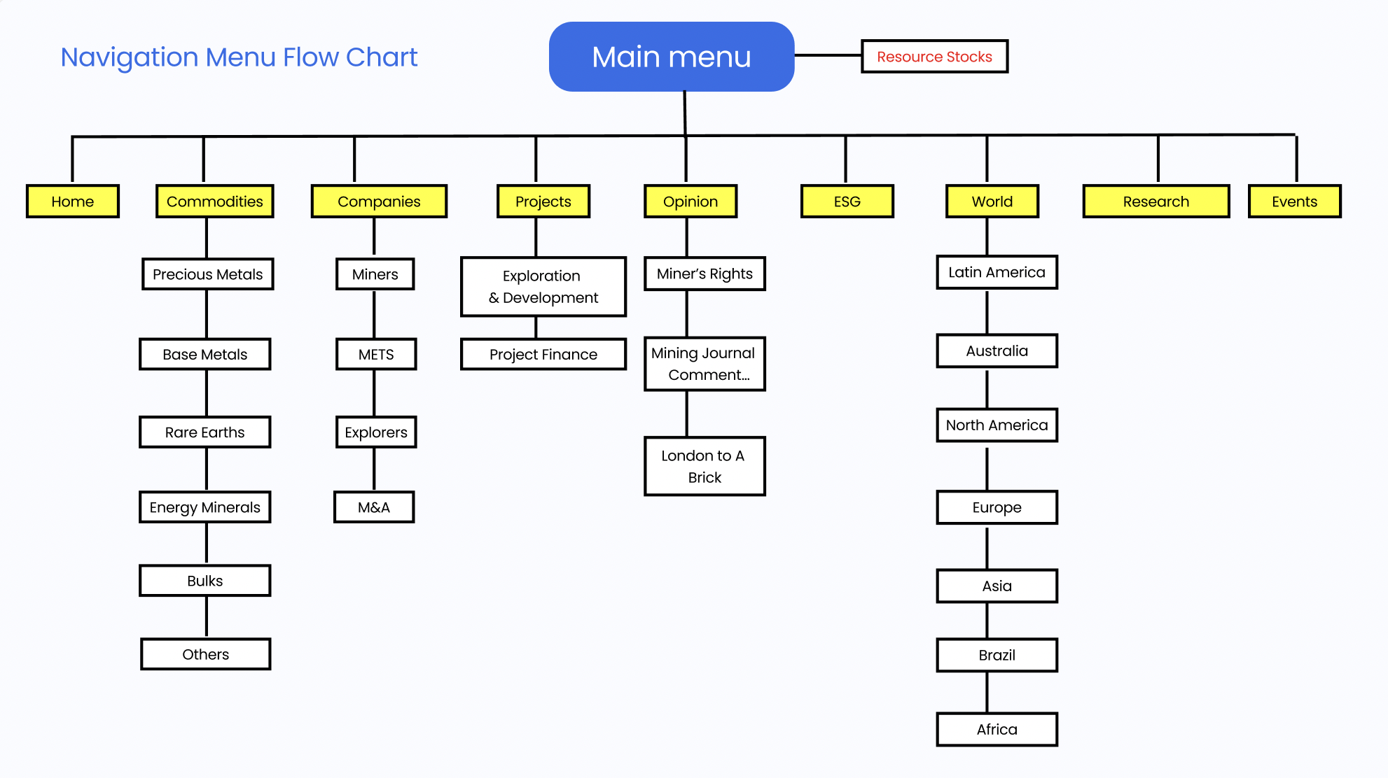
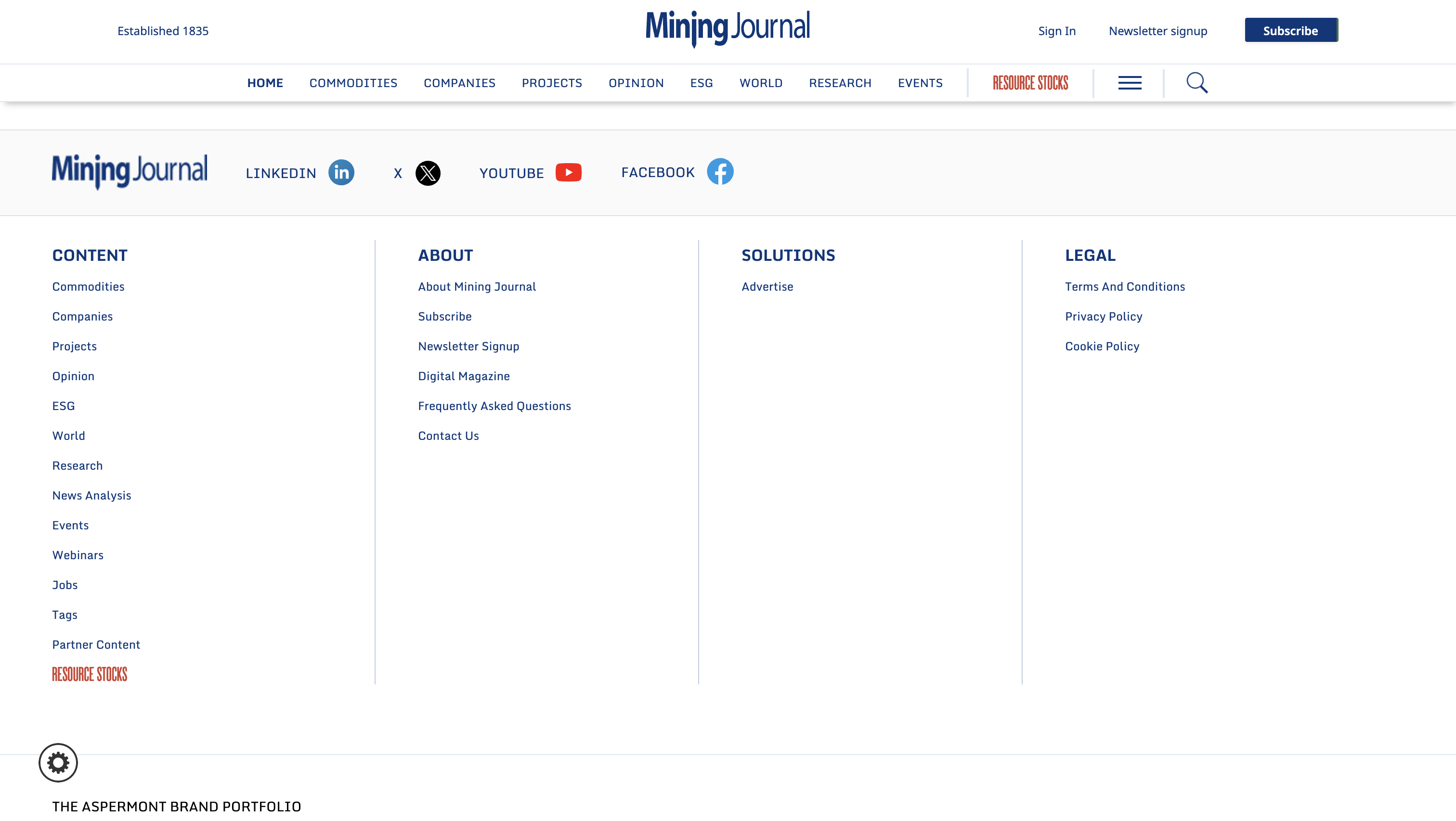
Highlights

Previous
improved

FOCUS AREAS

  • Competitor Evaluation
  • Information Architecture
  • UX Flow
  • UX Analysis
  • Mobile Responsiveness
  • Redesign

KEY DISCOVERY

Discovered that unclear navigation, information overload, and lack of visual hierarchy were major barriers to user engagement.

Conducted a competitive evaluation of leading news journals to identify lacking areas and improvement opportunities for the Mining Journal.

Information Architecture of Mining Journal

LOW MOBILE RESPONSIVENESS

LANDING PAGE
SUBSCRIBE

Mobile usability is currently under-optimised,

  • Input fields are not mobile-friendly, elements like long drop downs are difficult to scroll through on smaller screens.
  • CTA elements (like the “Subscribe” and “Continue” buttons) may be too small or poorly placed on mobile. They need to be clearly visible and comfortably sized to avoid user frustration.
  • Manually mobile testing the flow on small screens would reveal design issues like inconsistent spacing and more that exist currently
  • Improving mobile UX is critical to reducing drop-offs, particularly for on the go users.

LANDING PAGE UX ANALYSIS

Click here to view

Click here to view

BREAKDOWN OF SUBSCRIPTION UX

Click here to view

REDESIGN OF SUBSCRIPTION FLOW

SOLUTION

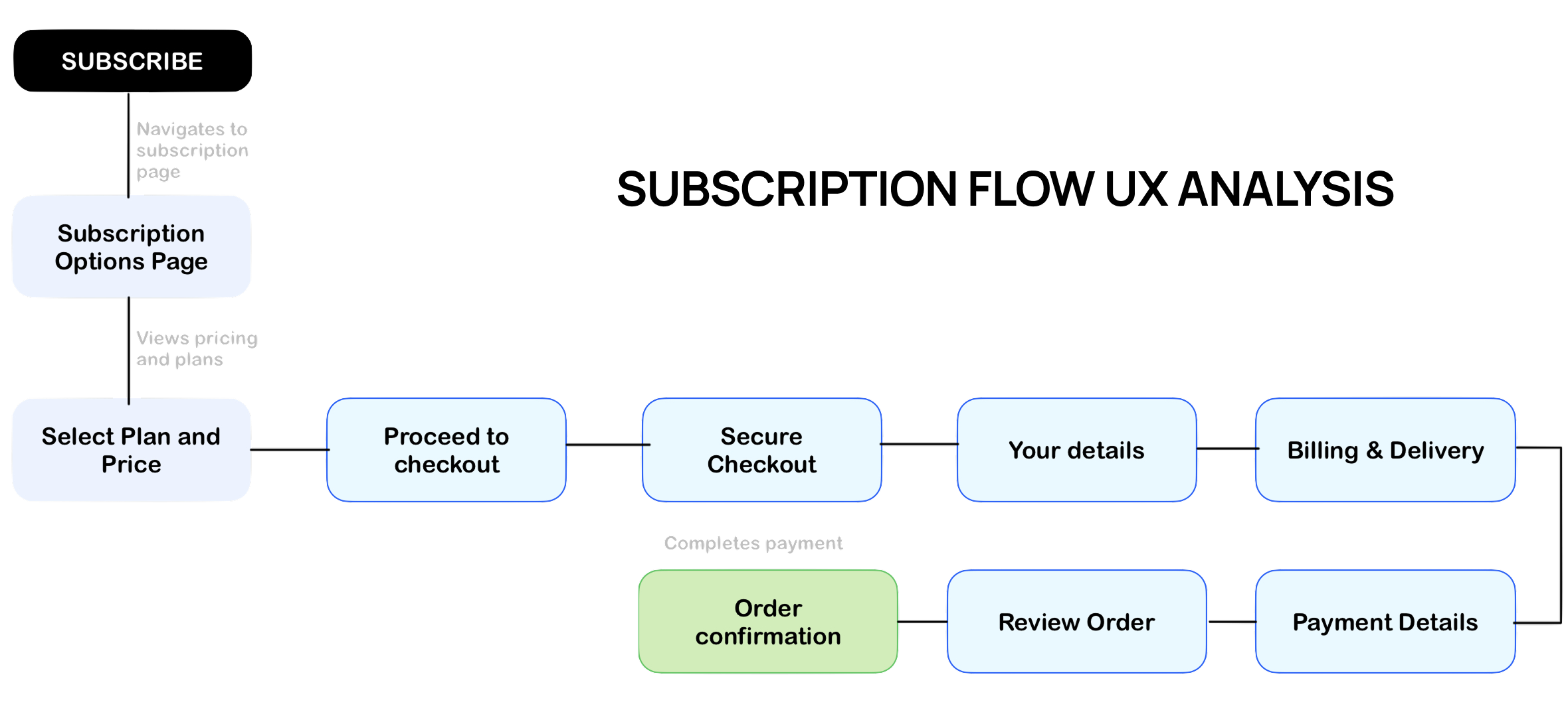
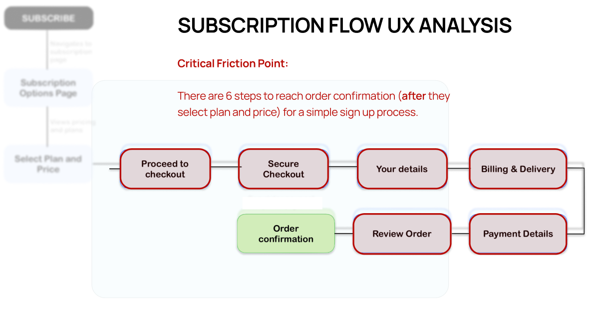
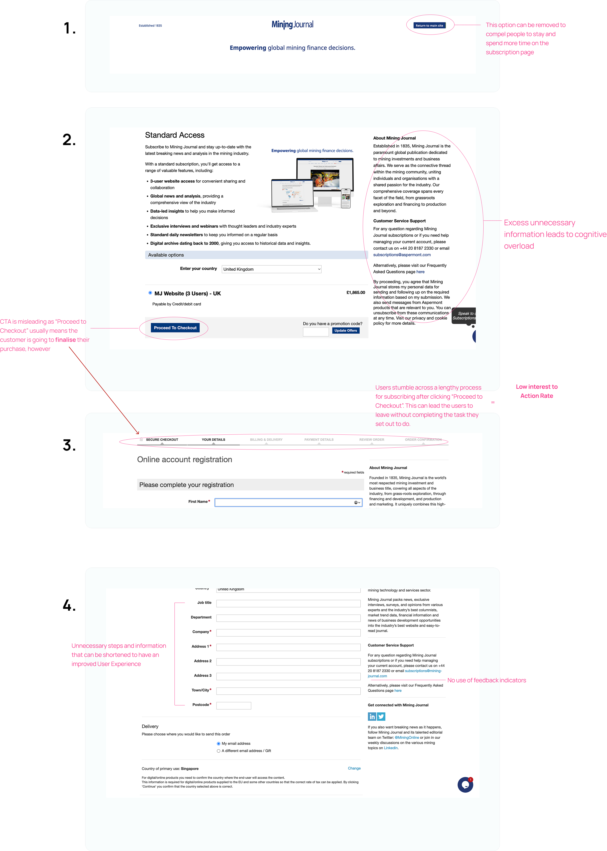
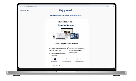
This is an improved version of the Mining Journal’s subscription flow, redesigned to address key UX issues such as cognitive overload, lengthy processes and friction points for users. The goal is to streamline the user journey, reduce drop-offs, and enhance the overall subscription experience.

Previous
Improved