
This was my university project for my Human - Centered Design unit, which required us to research a specific group of users within our reach and create a design solution that would help address a challenge they face everyday. For my project, I chose students living in my student accommodation at Chapter King's Cross in London.
During my research and experience as a student, I found that traditional key systems add unnecessary friction. In an increasingly digital world, advanced digital keys offers convenience and seamless access with a tap on your phone—no more lost keys, no more lockouts.

What challenges does this design system face?

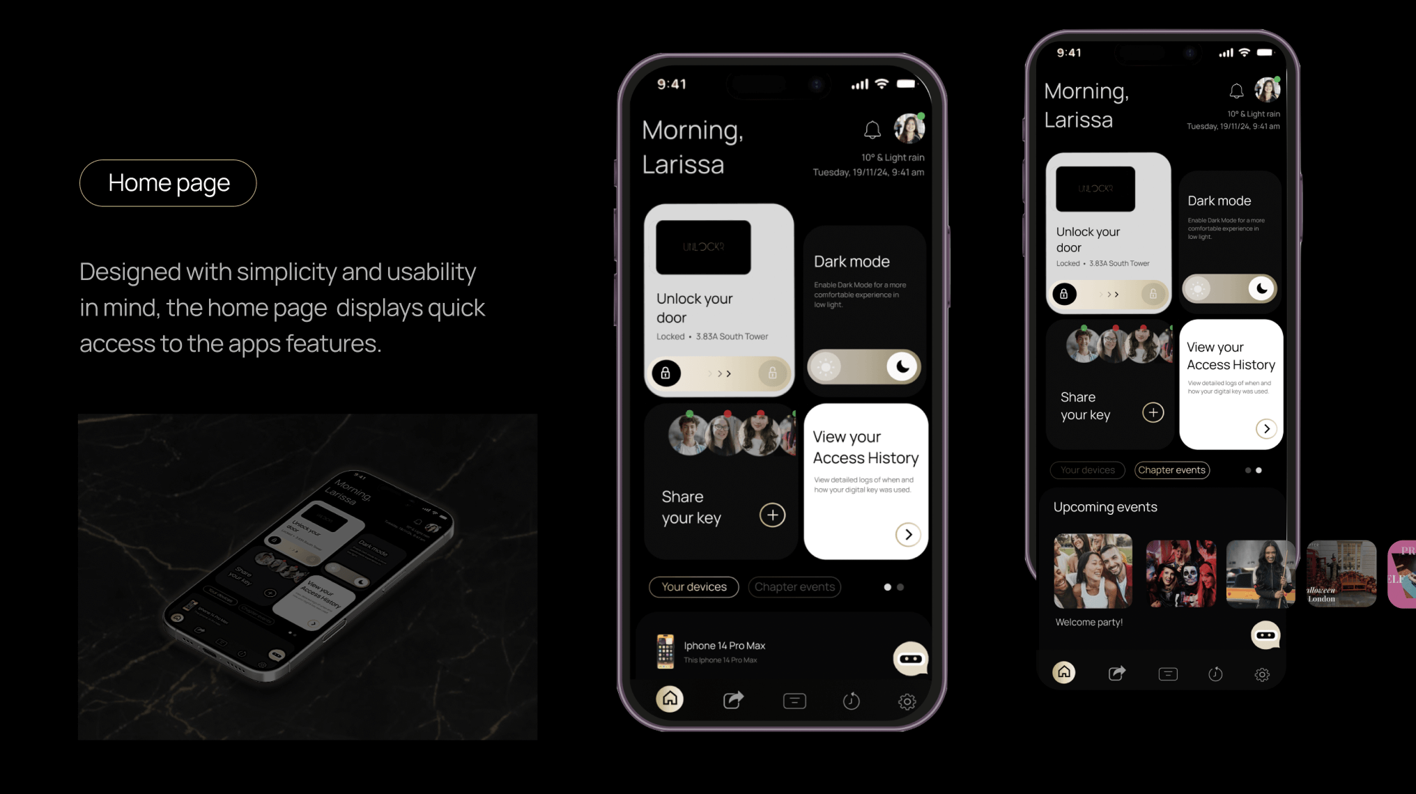
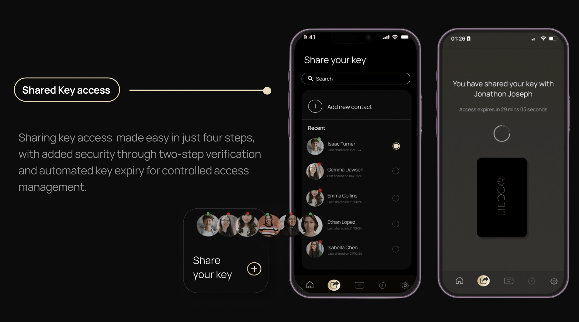
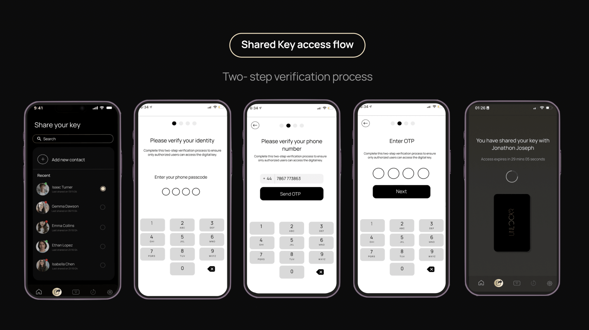
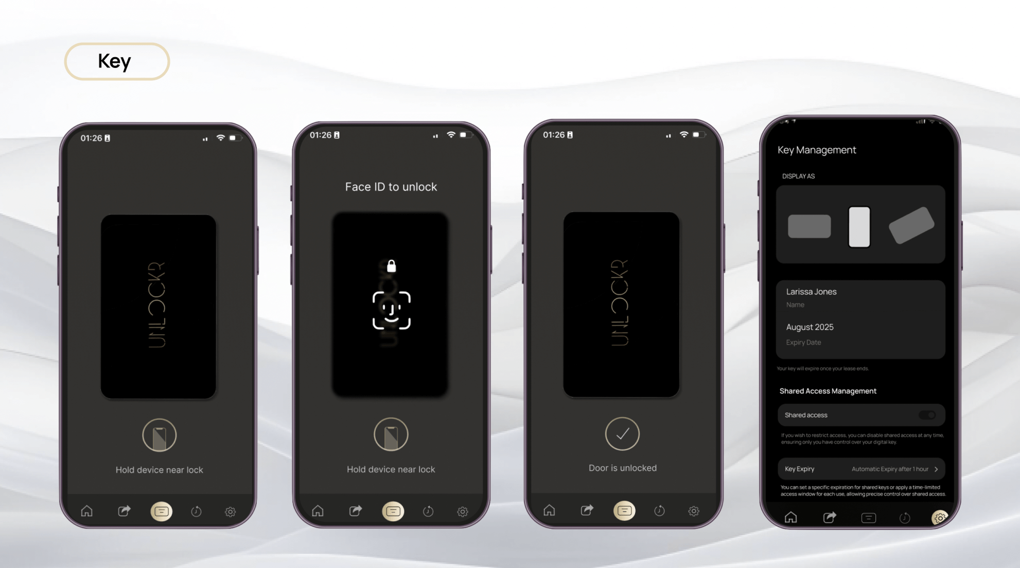
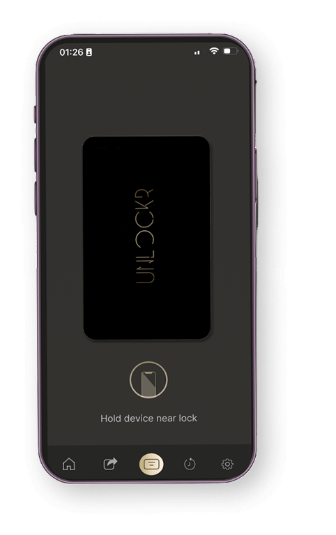
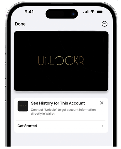
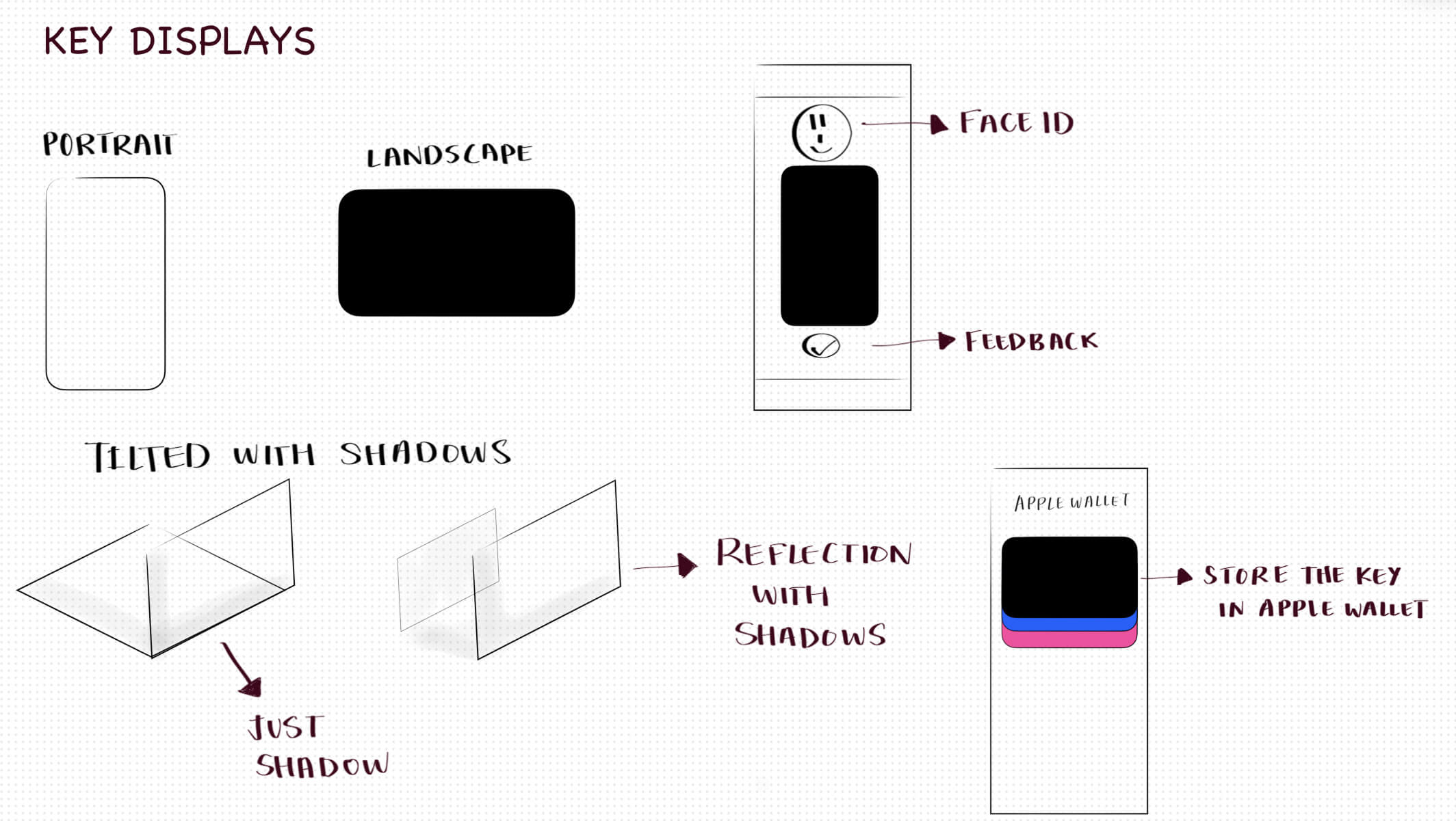
Digitizing keys like everything else—replace outdated systems with secure, instant access straight from your phone.
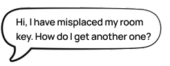
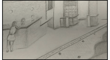
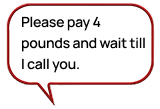
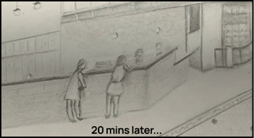
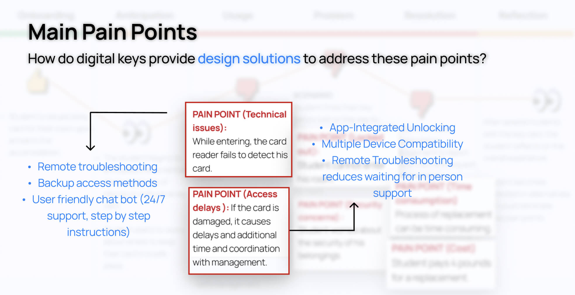
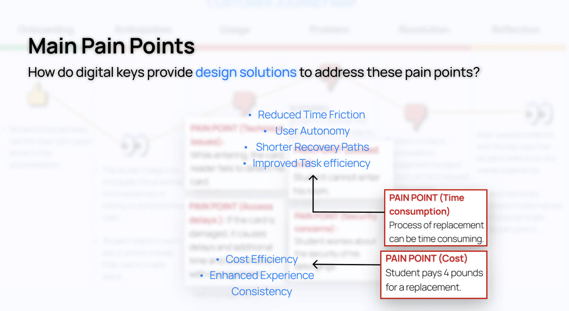
Lost or faulty key cards and forgotten keys lead to delays and lockouts. Replacements and temporary keys are costly and inconvenient. Staff spend significant time managing key issues. Weekly orders for temporary keys are additional expenses.
Conduct research to understand users—who they are, what they need, why they need it, and their views on the issue. Develop on the information gathered and createa solution tailored to the users.
Understanding and Empathising with the user
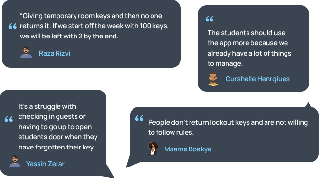
I began my user research by interviewing 9 receptionists about challenges they face while doing their job.

 Insights
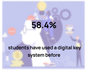
Next, I sent out a survey to students regarding digital key systems and received 42 responses.

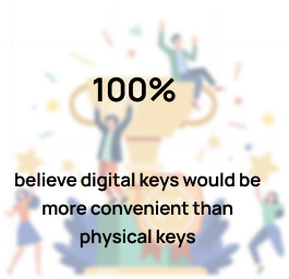
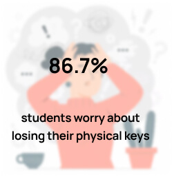
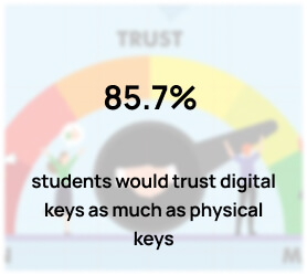
I identified several insights about how students and receptionists feel about digital keys.
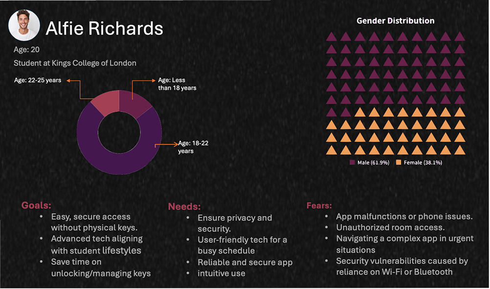
After completing my user research, I synthesised both quantitative and qualitative insights to craft a clear, data-driven user profile that reflects the needs, goals, and behaviours of my target audience.
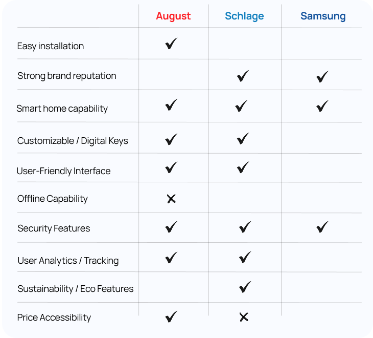
After conducting SWOT analyses of leading smart lock companies to identify their unique selling points and understand the competitive landscape, I proceeded to compare all three through a detailed competitive analysis to highlight key differentiators and market positioning.

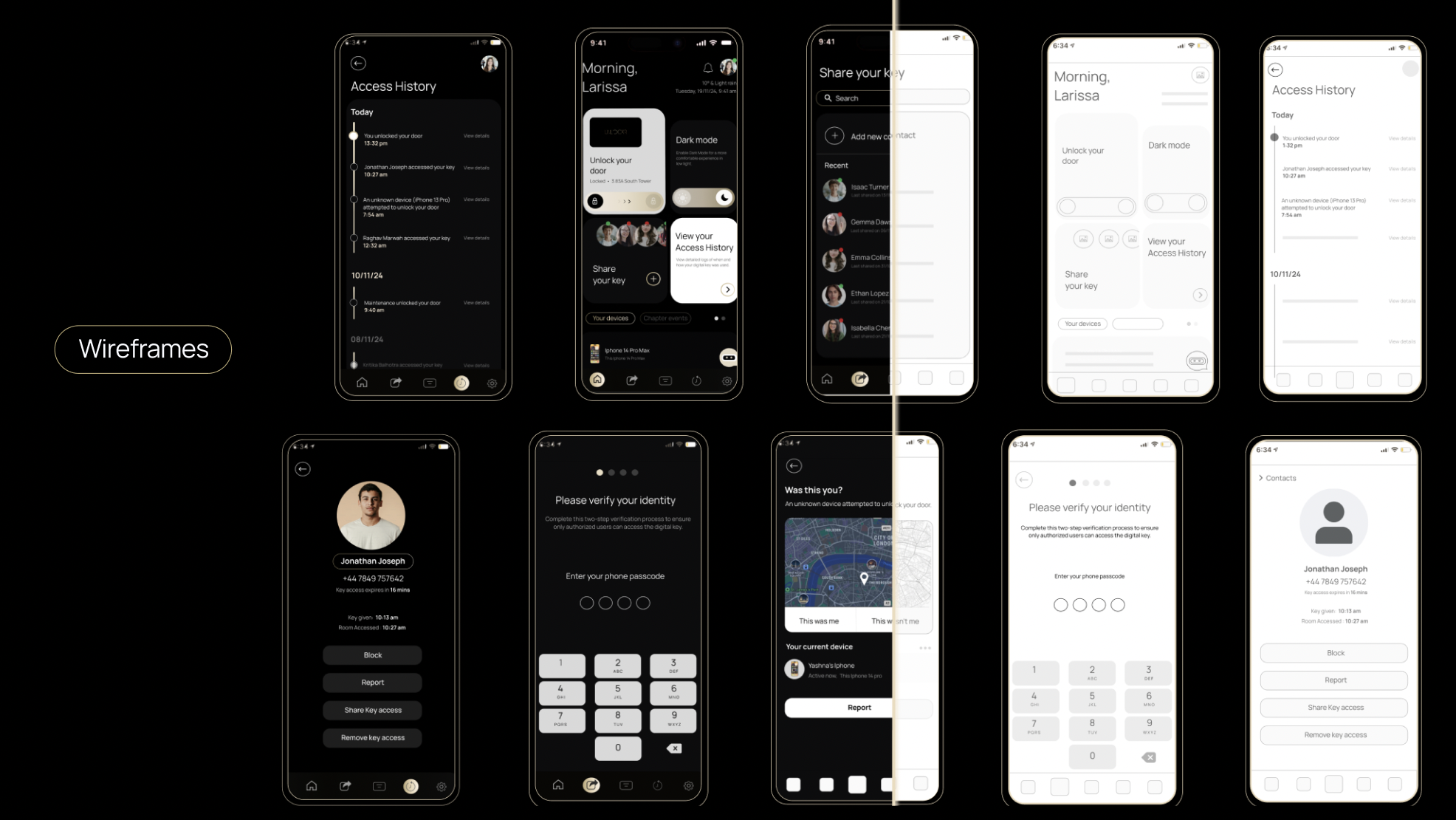
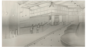
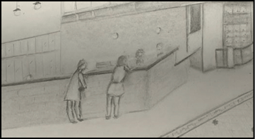
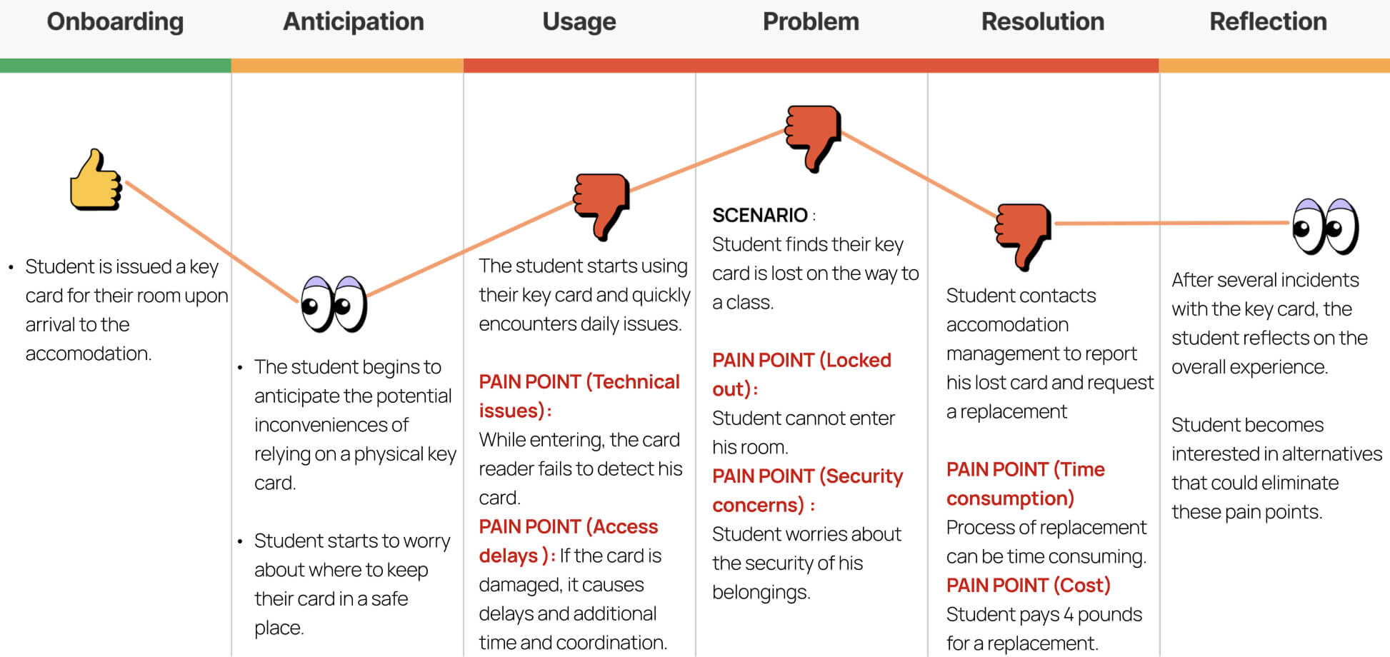
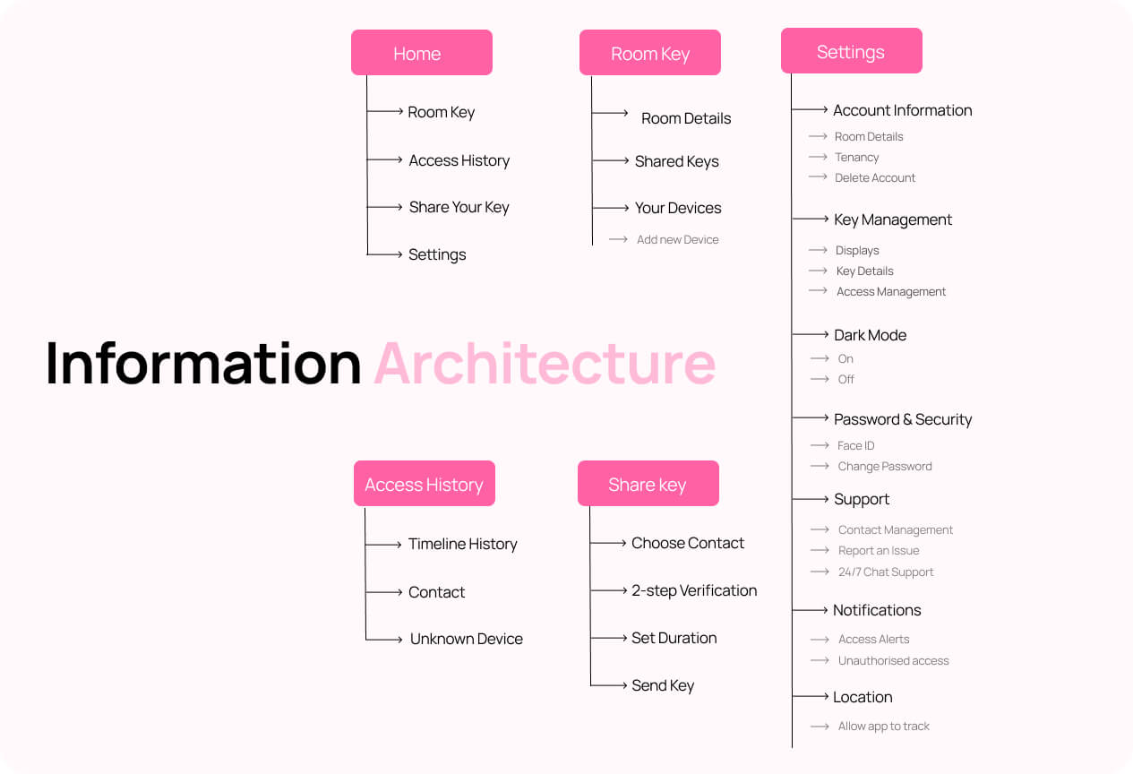
Visualising the user journey to uncover pain points and empathise.
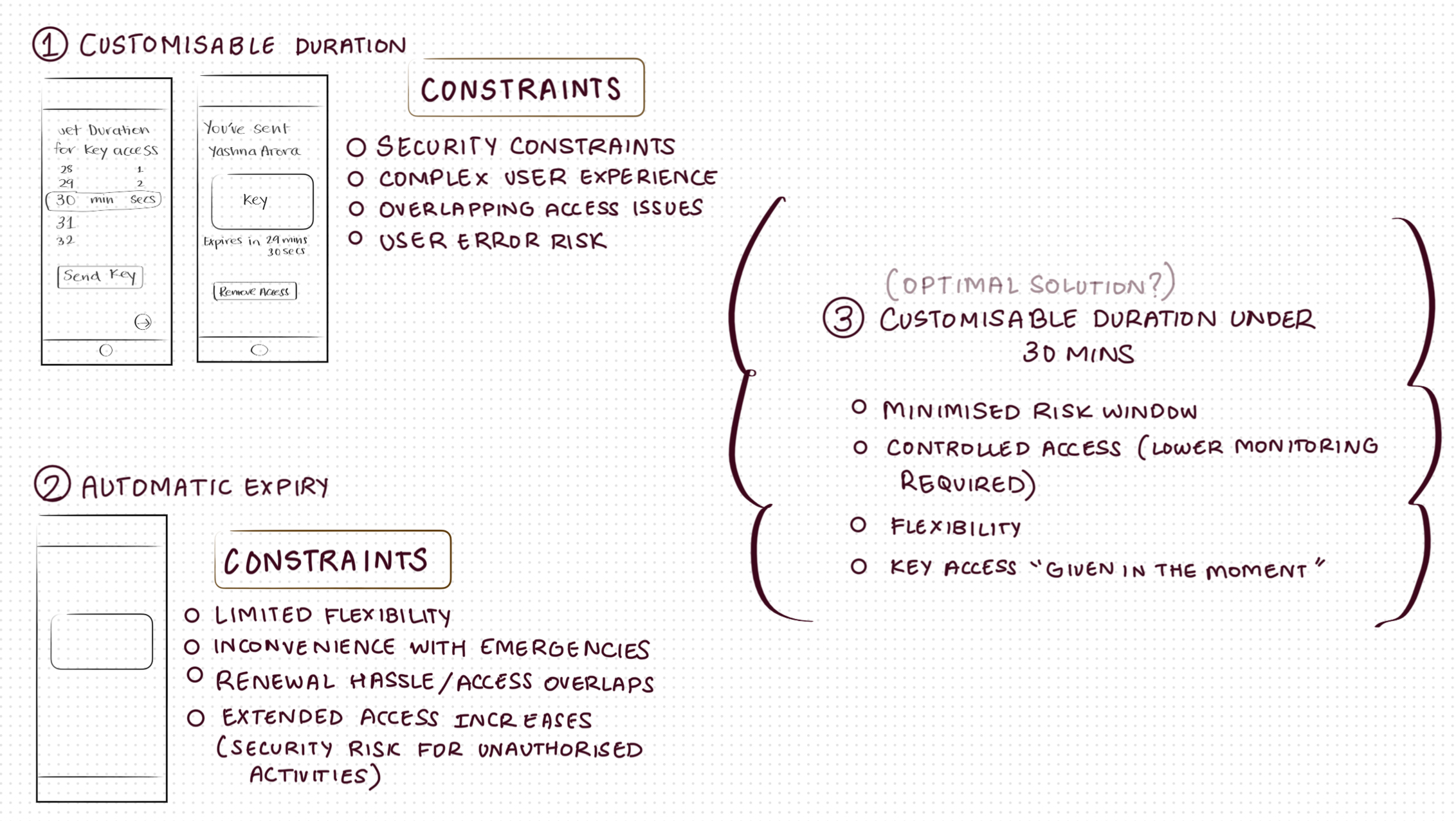
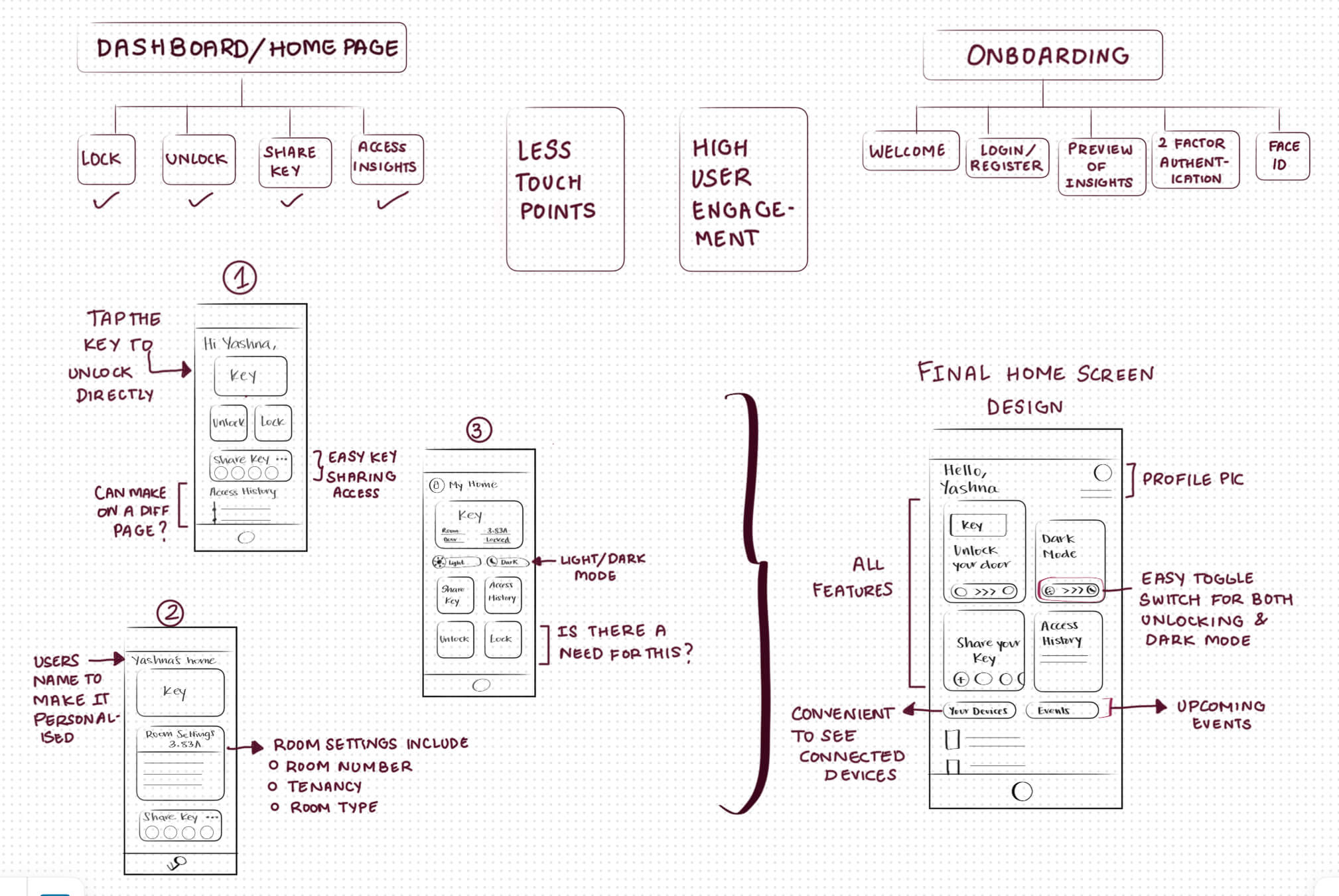
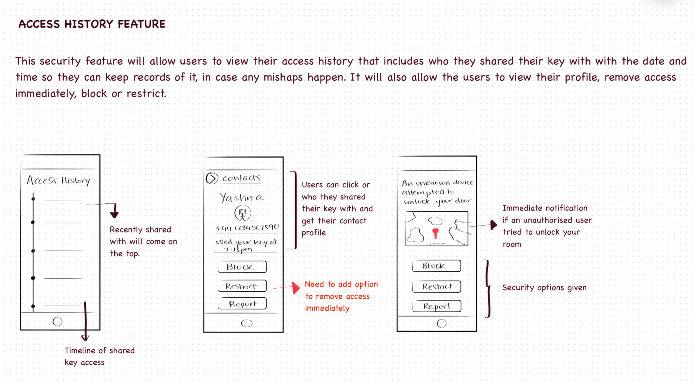
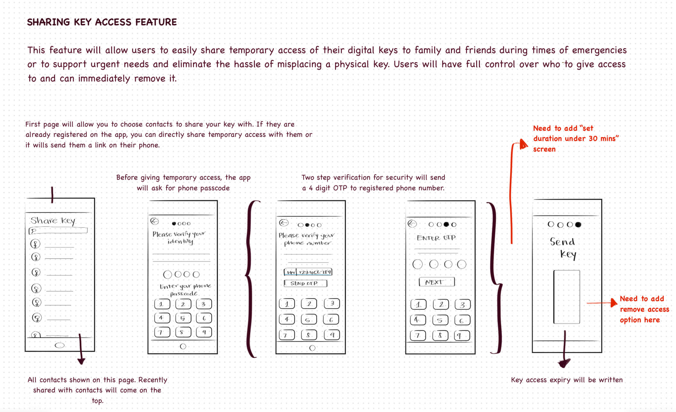
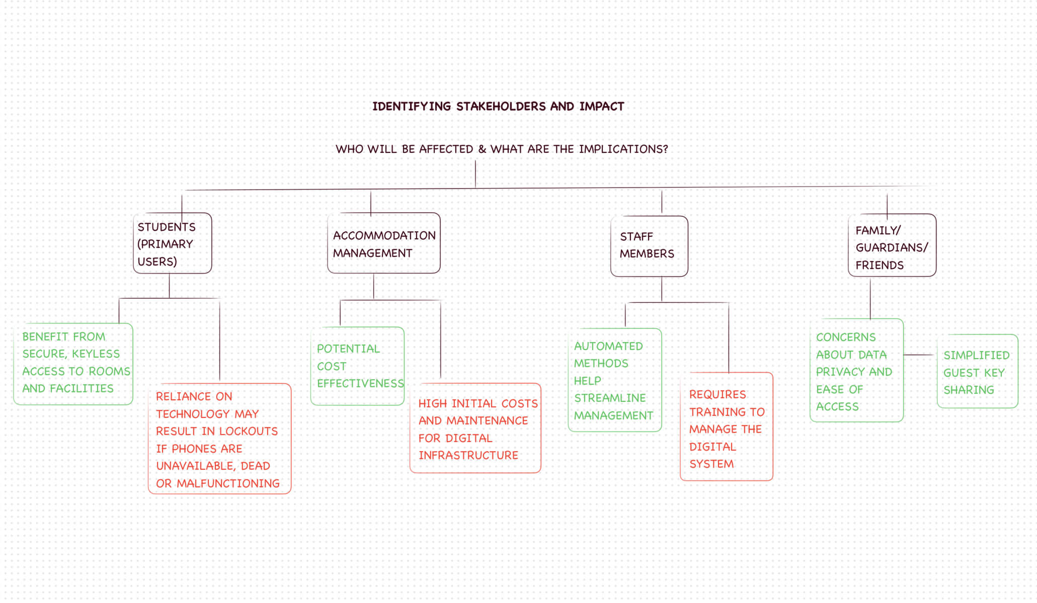
My initial explorations focused on feature development, solution optimization, stakeholder identification, and addressing troubleshooting and error-handling strategies.
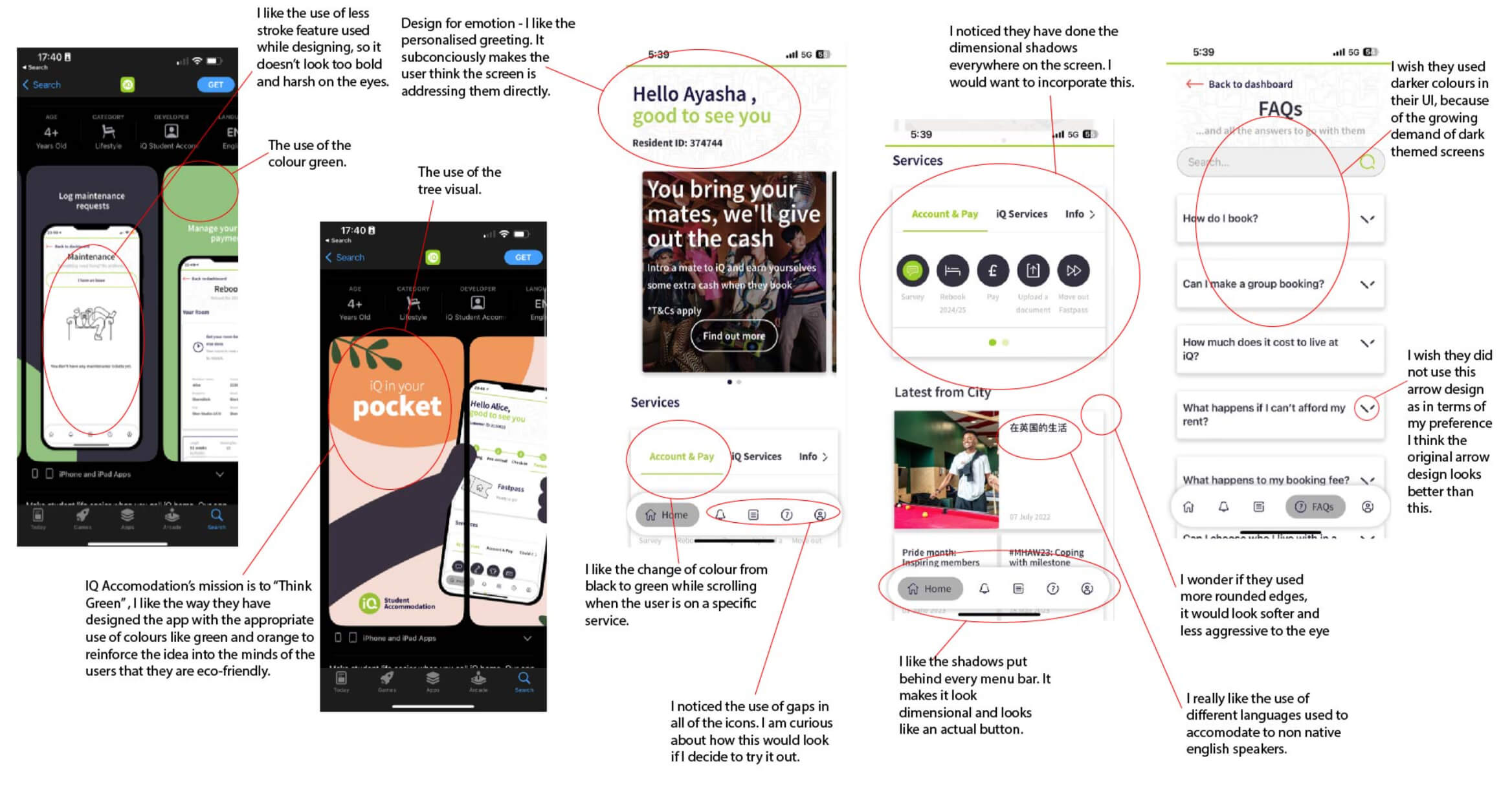
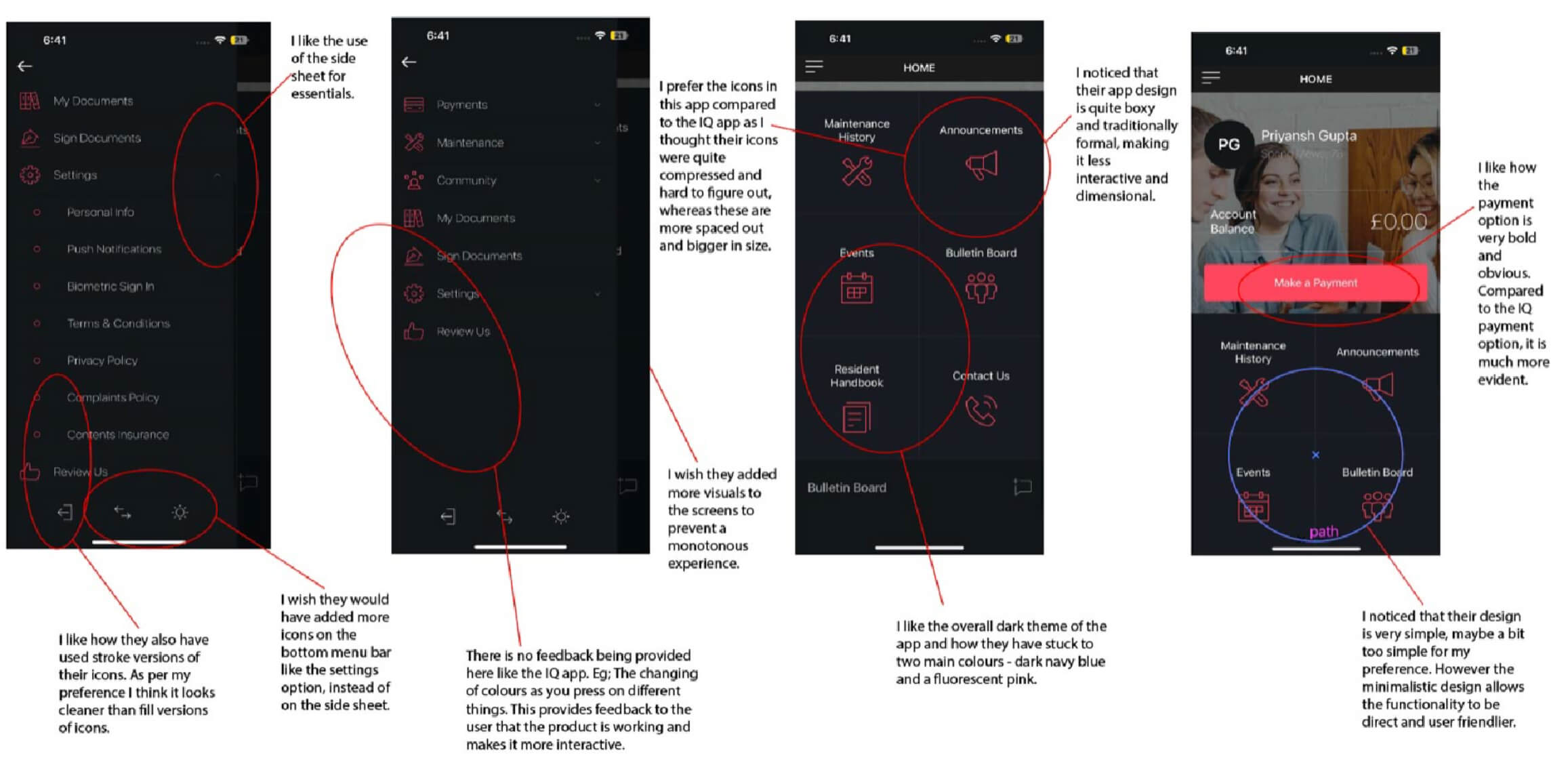
Alongside my own student accommodation app, I reviewed three existing apps in London to understand their User Interface approaches to gather inspiration and see what direction to go in for my design.
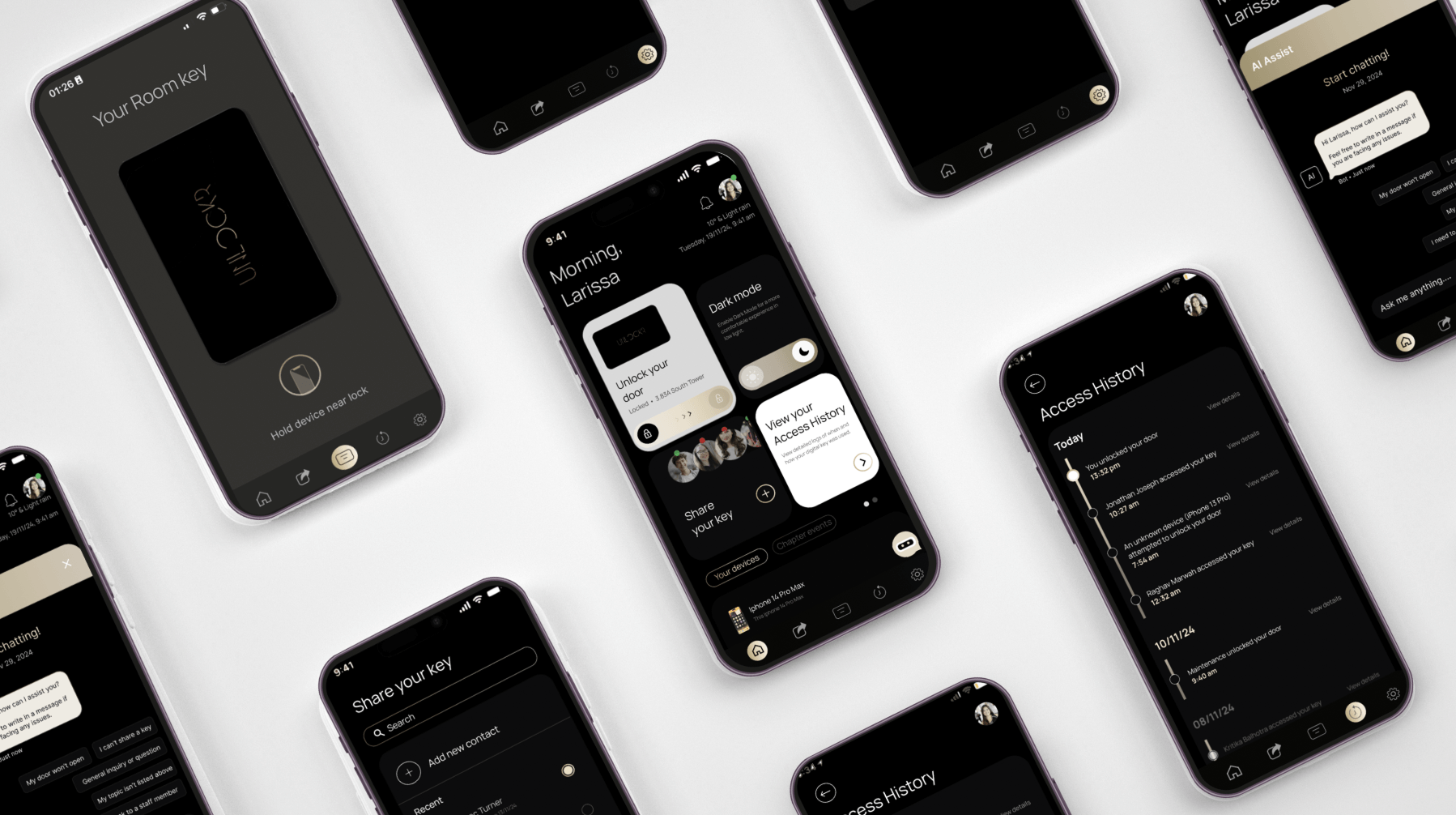
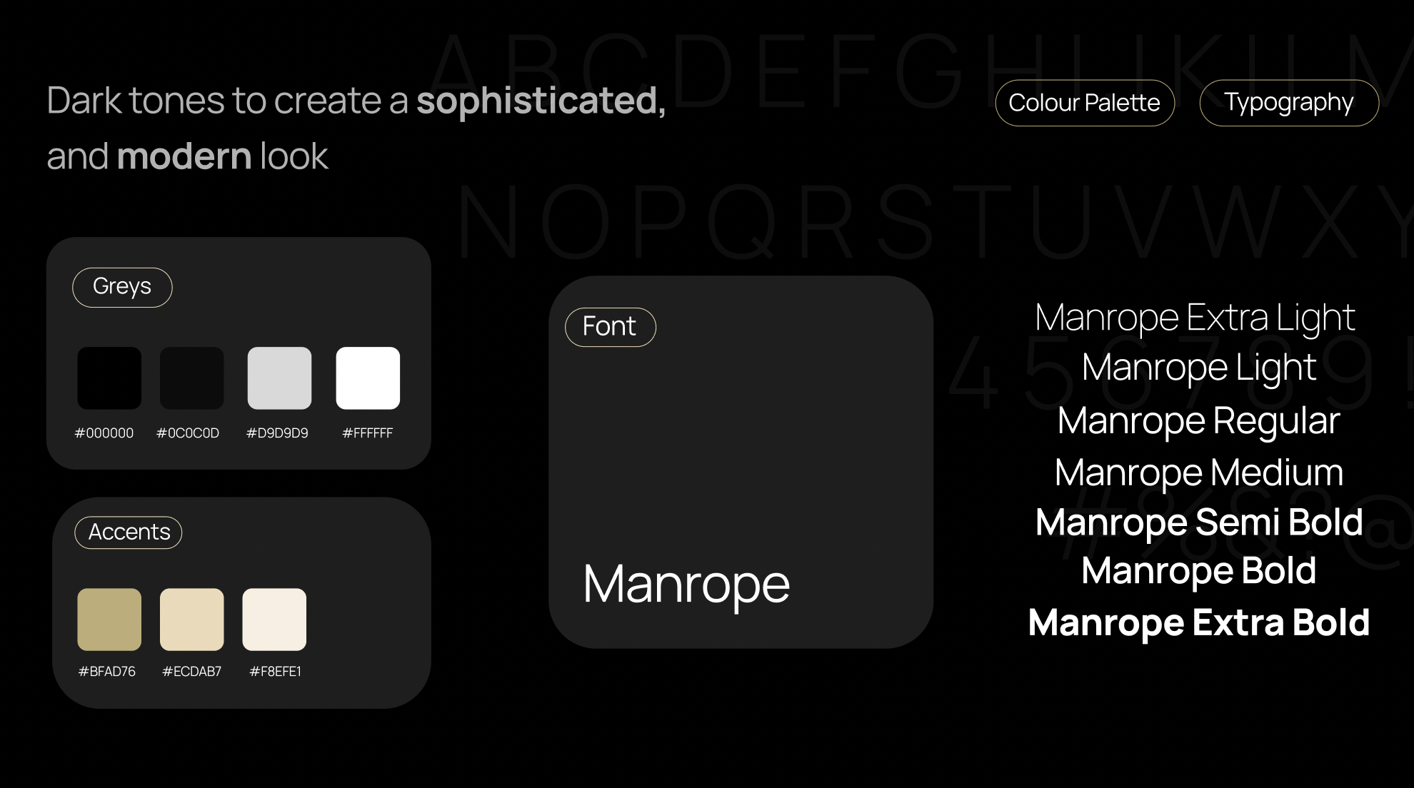
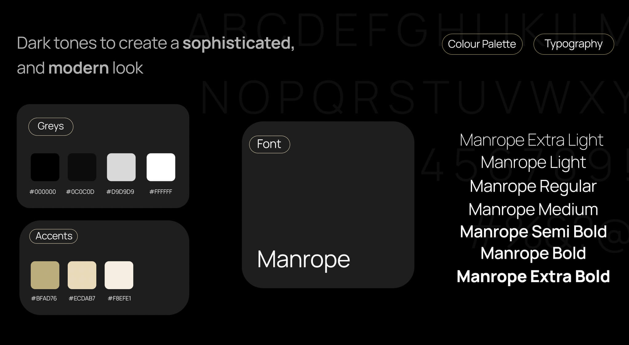
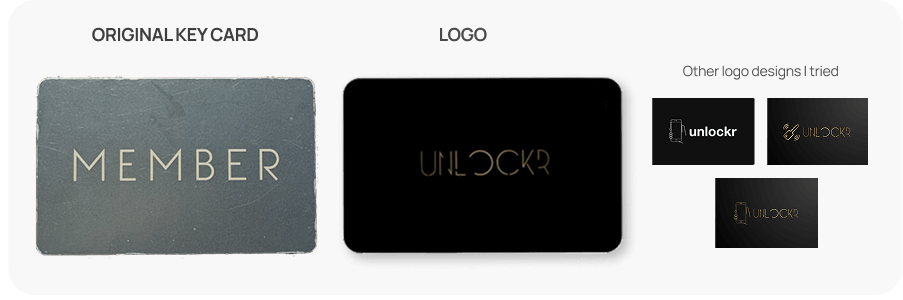
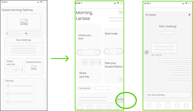
My logo design was inspired by the original black-and-gold key card from Chapter student accommodation, keeping the look consistent and authentic to its context. I aimed for a clean, minimalistic logo like those used by major brands that feels like a real, functional app icon. I am a fan of dark mode, naturally I gravitated toward a black base, avoiding excessive elements to maintain memorability.
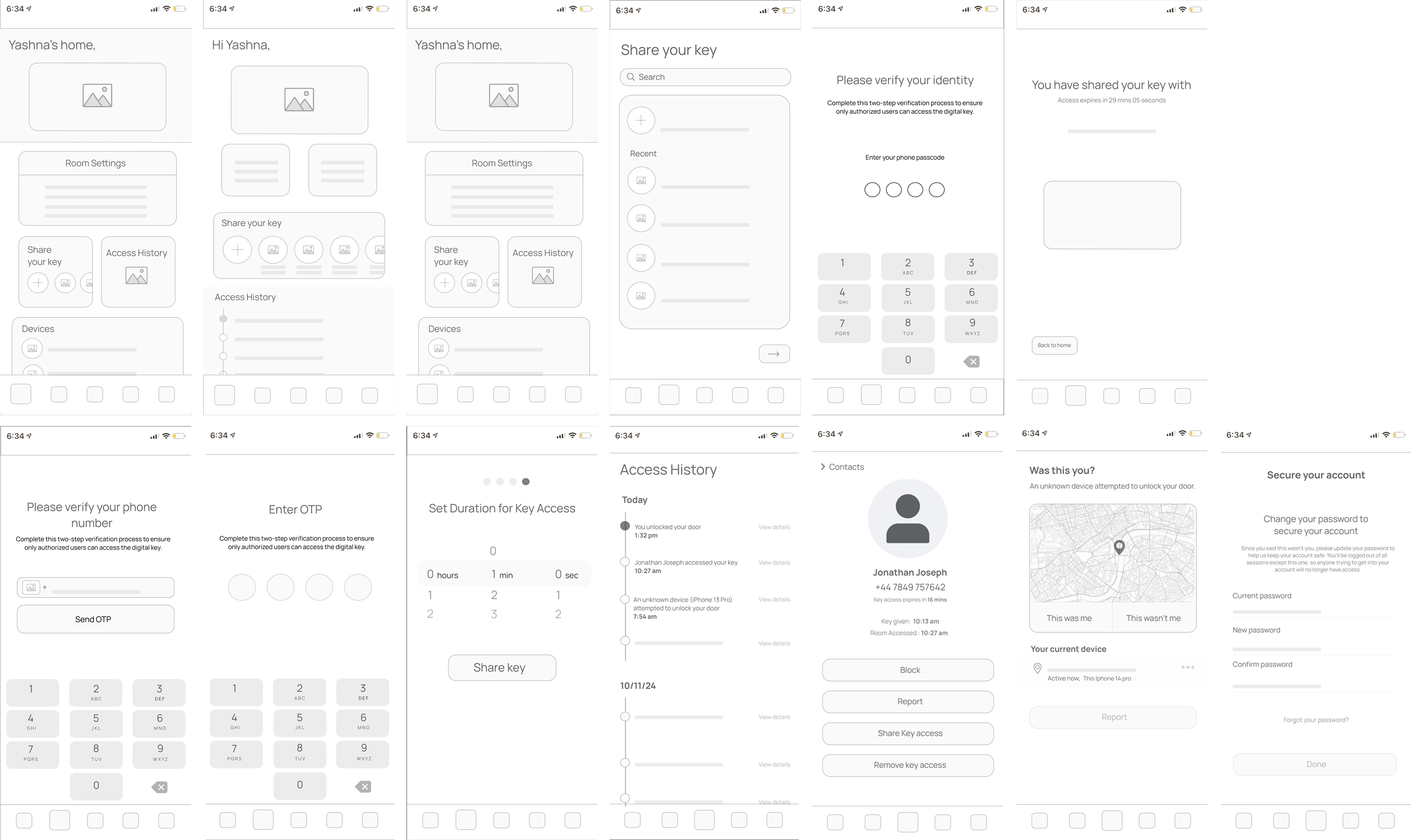
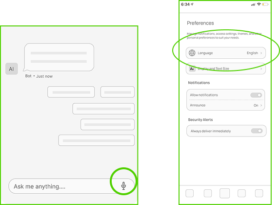
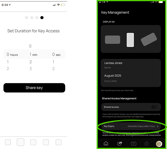
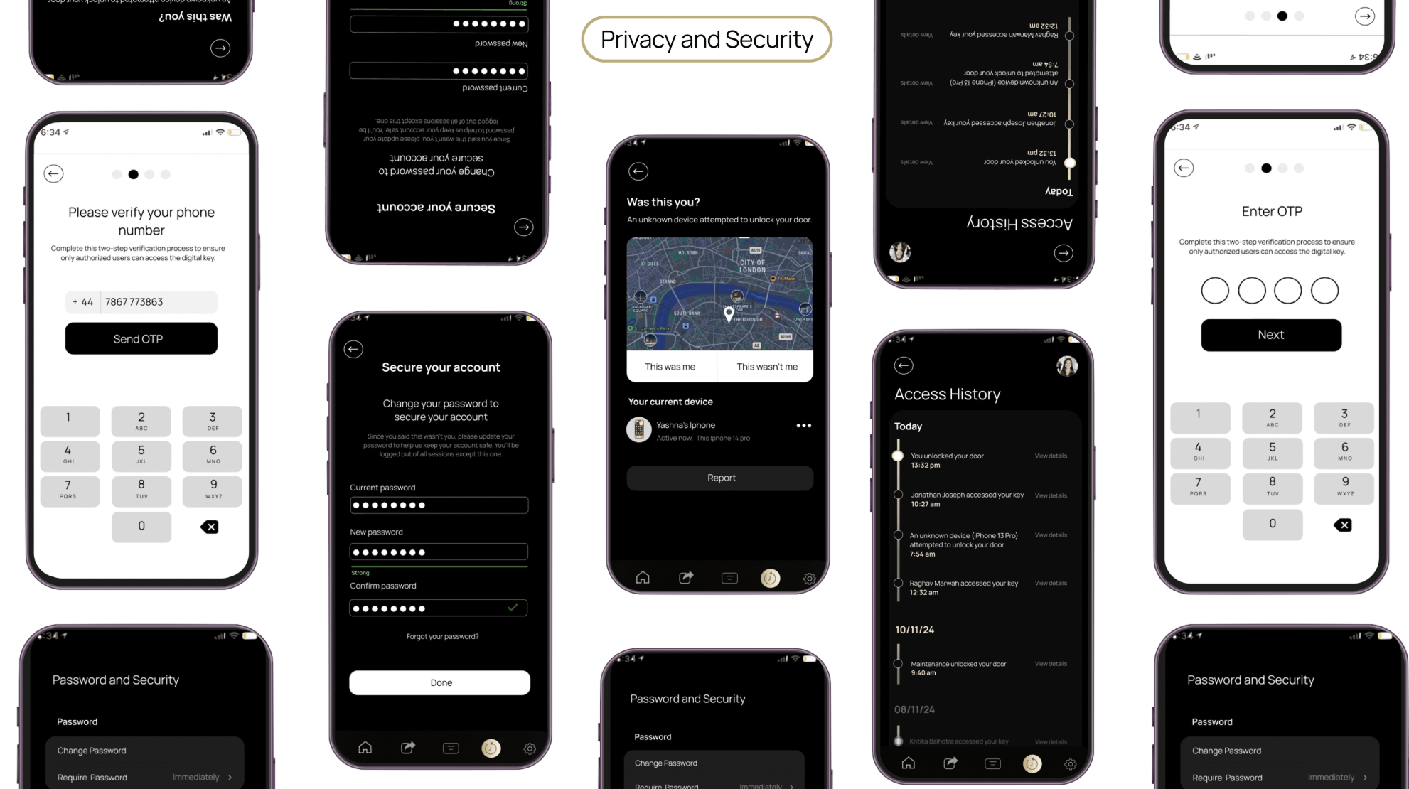
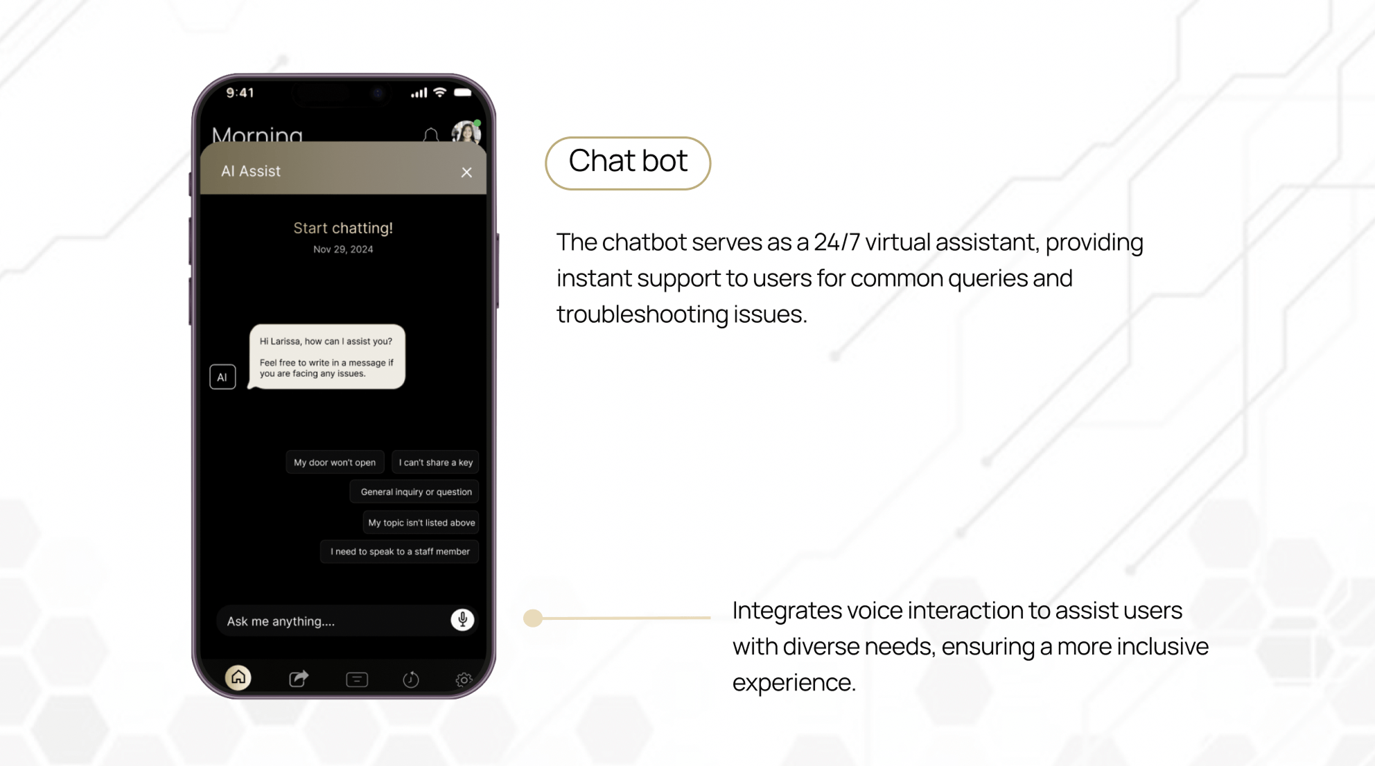
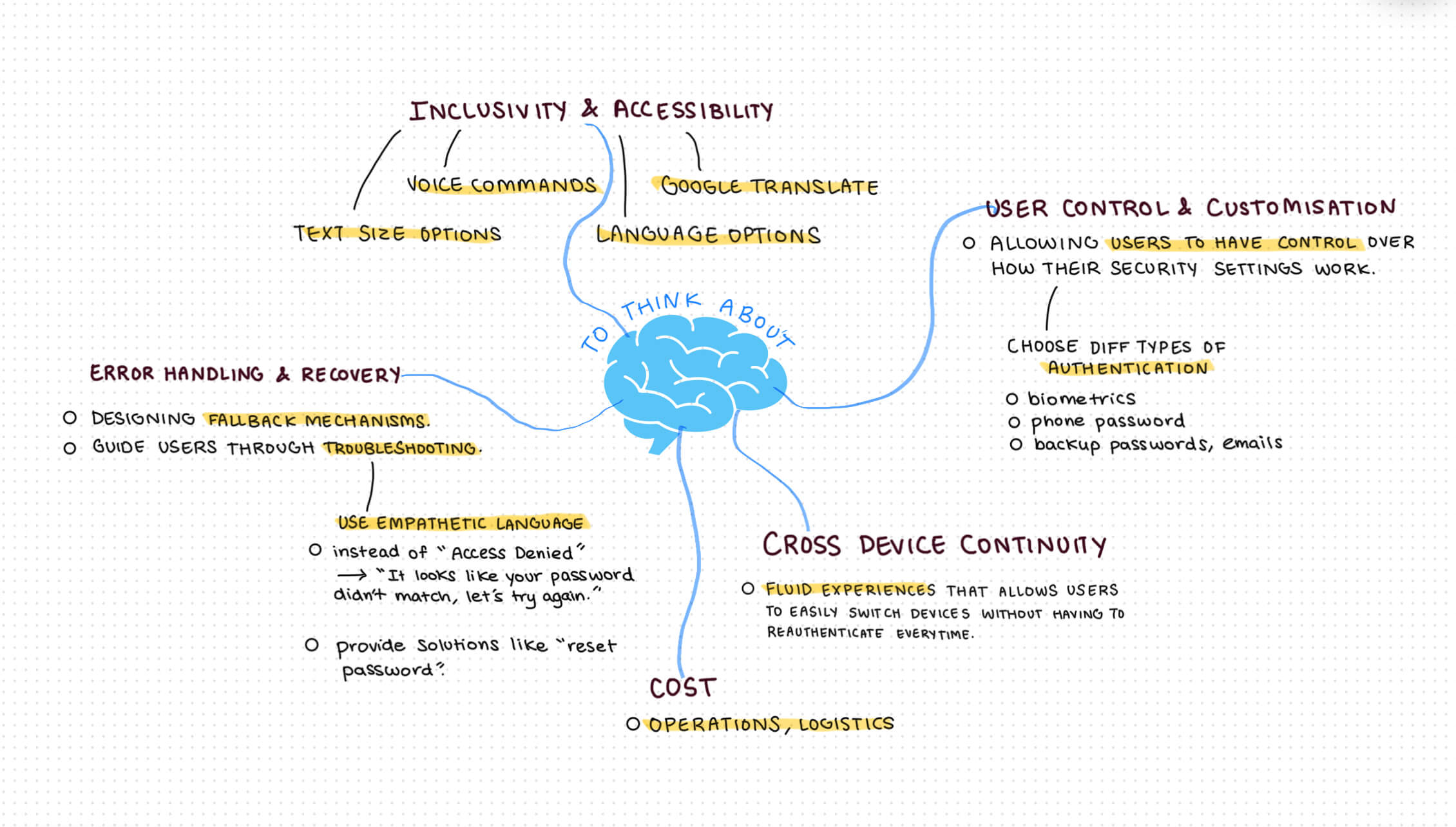
After receiving mentor feedback, I incorporated inclusive design into my second iteration to improve usability, accessibility and broaden market reach.